
In the digital age, the face of your company often begins with a portrait. Employee portraits are not just a compliance requirement; they embody the ethos of your organization and the personal brand of your workforce. At Eikonice, we revolutionize how these portraits are taken, edited, and managed through an automated, cloud-based solution that ensures GDPR compliance while enhancing brand consistency and cutting costs. In this blogpost, we delve into an often overlooked but crucial aspect of portrait photography – colour theory. Understanding how colour impacts perception can transform a standard employee portrait into a powerful tool for corporate identity.
Colour symbolism through the ages
Historically, colours have played a significant role in cultural symbolism and art. Red, for instance, was used in Renaissance paintings to attract attention and highlight important figures, symbolizing both power and passion. In Egyptian culture, blue was believed to ward off evil, representing both the sky and the divine.
In modern corporate environments, colour continues to influence perceptions. Blue, often seen in the logos of banks and technology firms, denotes reliability and trustworthiness. Green, used by companies promoting health and sustainability, suggests growth and renewal. Understanding these associations helps corporations choose portrait backdrops that reinforce their brand values.
Neuroscientific research on colour
Colours aren’t just seen; they’re profoundly experienced. Extensive neuroscientific research demonstrates that colours significantly influence both cognitive functions and emotional states. This understanding is crucial not only in art and design but also in creating environments that promote specific psychological responses.
When we perceive colours, specific areas of our brain are activated, particularly the visual cortex. The process is complex and involves not only the direct perception of colours but also their interpretation based on past experiences and cultural associations. This neurological activity can trigger various hormonal responses, altering mood, mental clarity, and even physiological reactions.
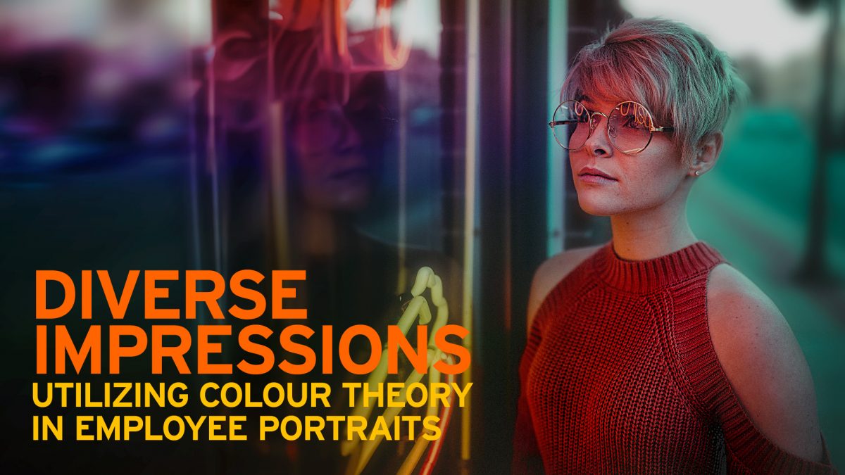
For example, blue wavelengths are known to stimulate the production of melatonin, the hormone responsible for regulating sleep, which explains why blue can have a calming effect and potentially enhance creativity. In contrast, the colour red can cause the brain to release more adrenaline, which increases heart rate and blood flow, thereby heightening alertness and improving the ability to pay attention to details. Red’s impact on decision-making speed is also notable; it can lead to quicker, more immediate reactions, which is why red is often used in spaces where vital decisions are made and in warning signs.
Understanding these effects, corporate portrait backgrounds can be strategically selected not just to align with brand colours but also to invoke specific feelings and associations. For example, using a subtle blue background for employee portraits might suggest a calm, reliable, and creative workforce. Conversely, a red backdrop might be more suited for roles that are dynamic and result-oriented.
Use the background colour wisely
The expanded understanding of how colours affect the mind and body not only enriches our approach to portrait photography but also allows us to design a work environment that enhances employee well-being and productivity. Through Eikonice’s automated portrait solutions, companies can harness these insights to create powerful, psychology-driven portraits that resonate with both employees and the audiences they engage.
The strategic use of colour in employee portraits can profoundly influence both internal and external perceptions of a company.
Colours that are used wisely and chosen strategically to align an employee’s portrait background with the desired corporate image and the individual’s role within the company.